By sending us good-quality photographs of you, your family, or your subject, you allow us to present your work and your article in more beautiful and effective ways.
If you send a low-resolution photo, we often cannot print them. Low-resolution photos are too small to be used, and are unfortunately discarded.
Below we share with you a set of do’s and don’ts for good photography.
Dos & Dont’s for Good Photography
What is High-Resolution?
Similar to how a printed photo is made up of dots of paint, a photo is made up of pixels. A high-resolution image file will often have millions of pixels. You will be able to zoom in to see details, and the file size will be something like 4 megabytes, or much more.
This image is an example; you can see that there’s plenty of detail to the large, HD (high-definition) photo, but the Low-Res (low resolution) pixelates immediately when you try to see the details.

Copyright
Do not submit images to which you do not have the copyright. By sending us photos, you consent that you own the copyrights, and are extending to Seton the licence to use them in a variety of formats, for distribution, editing, and any manipulation necessary for our use in print and online.
Filters
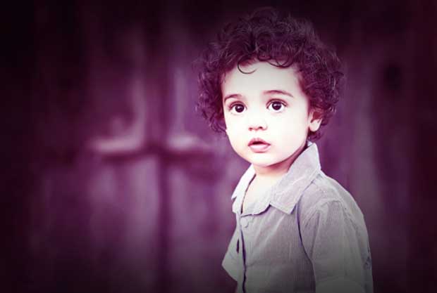
Don’t add any borders/gradients/filters to your images. If need be, our designers can add them. But they cannot be removed. Here’s an example with extreme borders and over-filtered colors – please don’t do this:
Focus & Blurring
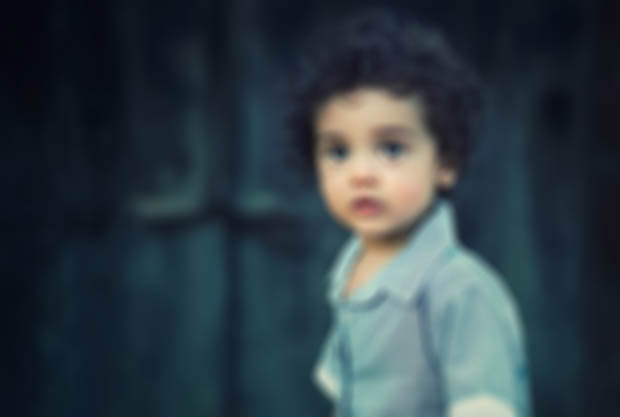
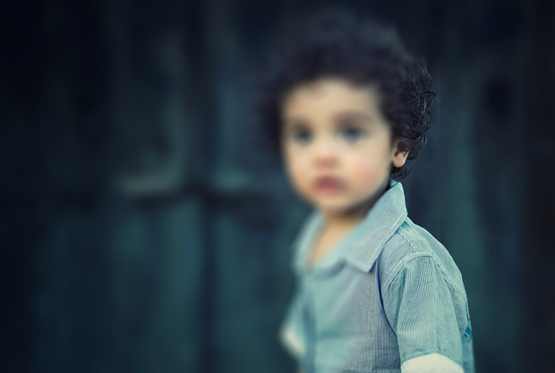
This is one of the biggest things that forces us to disqualify image submissions, when the image is blurry, or when the focus is on the wrong element in the photo. The focus (area of greatest detail and clarity) should always be on the area in the photo at which we are supposed to look.
This first photo is all blurred, and unusable.
In this photo, our eye is drawn to the face, and it is blurred out in favor of the shoulder. If the photo were composed so that the shoulder was the thing to look at, this might be different.
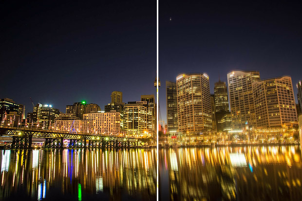
If you have a long-exposure shot where you opened the lens for a longer period of time, rest it on something solid so that the details aren’t blurred.
As you can see in the photo below; the one on the right was not steady when the shot was taken. Details are blurred. On the left , it was placed on a bench, or a rock for stabilization.
Noise and Compression artifacts
When a photo is taken with a low quality camera or a poor cellphone, it is filled with ‘artifacting’. The image below is an example. We try not to print those kinds of images, and opt for clear, clean photos for printing, so that your article is illustrated well.

Date/Time or Text
An embedded creation date/time is an absolute no-go – even if it is very small. Also, don’t include your name or any copyright marks.

Dress Guidelines
Seton Magazine maintains strict photography publishing guidelines as established by Dr. Clark. In keeping with these guidelines, please note:
- shoulders and midriff must be covered
- no short skirts or shorts
Read our full Terms & Conditions regarding your rights and our licence to your submissions.

 Seton Magazine Catholic Homeschool Articles, Advice & Resources
